Exterior paint – 8 shades of grey… and 4 of cream

As mentioned in my last post, I was supposed to pick a masonry paint colour on Saturday – instead this is how my paint making decision panned out:

  • 1 Castletown exterior paint colours recce (with Stacey in tow)
  • 1 Port St Mary exterior paint colours recce
  • 1 Onchan exterior paint colours recce (in the car with Dad)
  • 4 hours (approx.) spent attempting digital mockups
  • 3 trips to Travis Perkins
  • 4 trips to B&Q
  • 12 sample pots of paint (I’m not telling you how much I spent on paint samples)
  • 1 tin of pure brilliant white
  • 5 days of deliberation

Which all resulted in this rather fetching camouflage effect.

Camouflage Paint Effect

So who were the contenders?

In the grey corner we have:

  • Dulux Crystal Grey
  • Dulux Dusted Moss 3
  • Dulux Dusted Moss 2
  • Dulux Dusted Moss 1
  • Farrow and Ball Elephant’s Breath (was colour matched in Valspar)
  • Sandtex Plymouth Grey
  • Sandtex Soft Heather
  • Sandtex Gravel

In the cream / beige corner we have:

  • Sandtex Cotton Pelt
  • Sandtex Chalk Hill
  • Sandtex Sandblast
  • Sandtex Magnolia
  • Sandtex Cornish Cream (I could be wrong but I reckon this is the current paint colour)

I’m not going to tell you which is which as I’m not even sure any more and I think I might have painted over some of the creams.

Very surprisingly nearly all the greys looked completely different on the house to how they appeared on the sample cards or in the tin – they nearly all looked more purple!  The colour matched Elephant’s Breath was the only colour I didn’t buy especially, I’d already used this to paint the inside of the fireplace where the wood burner will go – inside it’s a lovely warm but pale grey, outside, it’s a grungy taupe (it’s the browny one under the window)! Crystal grey is quite simply lilac (rightmost one).  Dusted Moss 3, 2, and 1 don’t look remotely similar to each other considering they are mean to be the same shade (I’d bought 3 and decided it was ok but needed to be slightly lighter so got 2 and 1 only to discover they were entirely different).

I had started off wanting grey but despaired after the first five samples were all wrong, hence starting on the creams. The creams were closer to how I expected but there was still a lot of variation which wasn’t evident from the pot or sample board. Dad’s vote was (very strongly) in favour of magnolia but if I was going to go down the yellow tinged route at all, it was to wimp out and go for Cotton Belt – which is what I was seriously considering on Tuesday evening.  It’s the ‘warm white’ to the right of the door in the photo below.

Paint Samples

Next door is Pure Brilliant White though so I was worried that if I went for an off white it would just look dirty compared to next door – I also still wanted the window sill and frames to contrast.

Anyway, I’ve been obsessing over paint for 5 days now so time to wrap this up.  The winner is…..  Sandtex Plymouth Grey!  The darkest of them all.  In the top photo there is a bit of Plymouth Grey to the right of the window and a stripe along the bottom.  In the photo of the door, it’s next to the doorbell and it’s the grey underneath the window in this photo.

Paint Samples

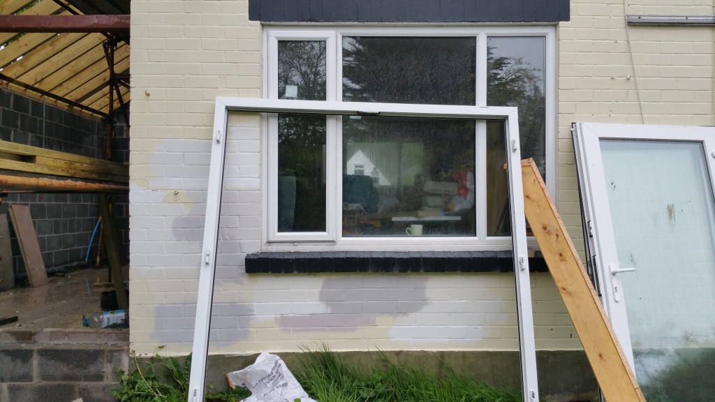
Sandtex Gravel was a close runner up – I actually preferred Plymouth Grey on the front of the house and Gravel on the back.  Gravel is bottom left in the photo above.

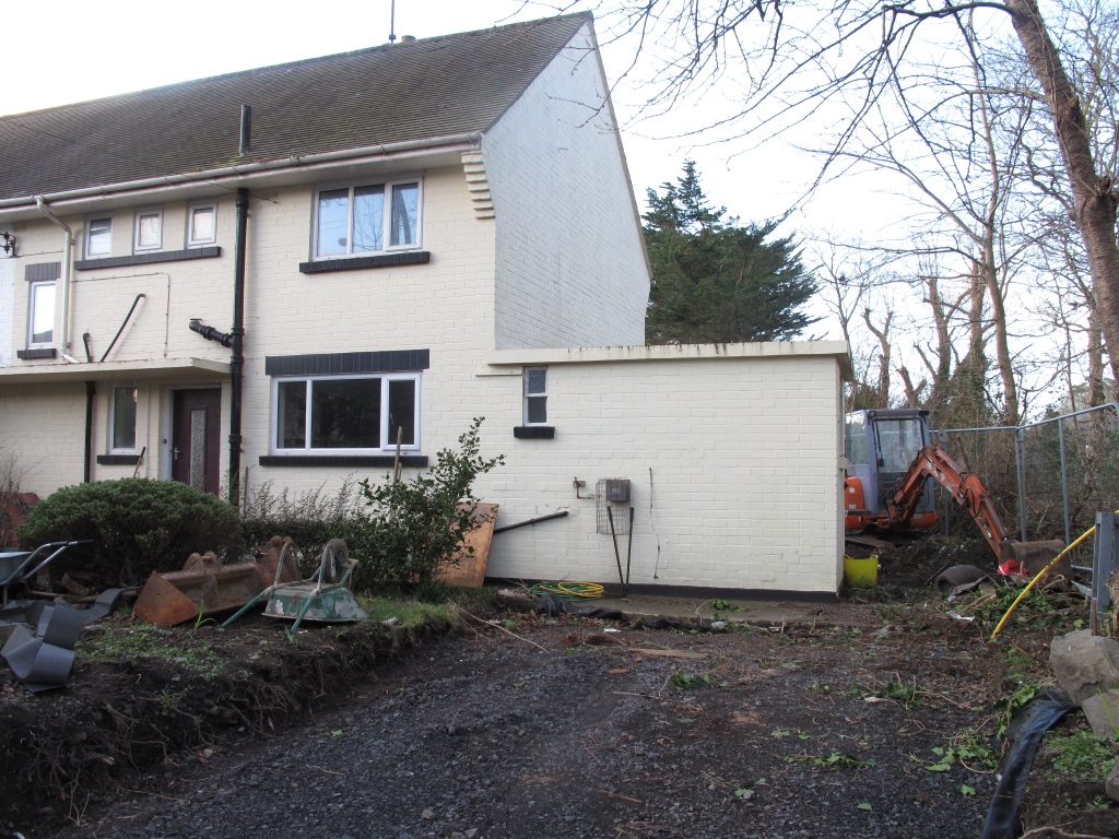
So decision finally made, I dropped the paint off this morning and when I went past this evening the scaffolding had grown and the gable end was grey 🙂

Sandtex Plymouth Grey painted gable

Very, pale grey! I think that’s just one coat but I’m glad I didn’t go any lighter – I actually thought they must not have got around to painting when I first glanced at the house!

Paint it Black?

I know I’m three weeks behind with the building work updates but tomorrow I’ve got to go pick a masonary paint which means I need to decide what colour the house is going to be.

It’s currently a yellowy buttermilk shade which isn’t really my jam. The extension needs to be painted the same colour as the rest of the house, and if I’m going to paint the whole house, the gable end should really be painted while the scaffolding is up and before the roof goes on. So yeah, I need to pick it now.

So, what colour should I pick? Next door is all white – which is fine but I think it’s nicer to have some contrast with the windows and window sills. I also want everything to be grey – it’s an unavoidable fashion, I’m going to end up with a grey kitchen, a grey bathroom, grey carpets, grey house…

But, as every pun writer knows, there are 50 shades of grey and my initial thought was that I wanted a dark one à la 10 Downing Street. Bonus fact – Downing Street was originally only black due to years of London pollution, when they cleaned and restored the facade in the 1960s they discovered the bricks were yellow and were forced to paint them back to black to retain the iconic look.

Farrow and Ball’s Railings is a lovely, almost black colour which is so popular I was sure someone would have tried painting a house with it before.

After a bit of googling it was looking promising – there’s the Hazel Pear Inn in Acton Bridge.

Before:
hazelpear-before

After:
hazelpear-afterPhoto source – Steve & Judy Pardoe

How much do the window frames ‘pop’?

Then there was this astonishing transformation of Arren Williams house in Canada.

arren-williams-railings-facade

Via House and Home

So, thinking I was maybe on to something I brought out the GIMP.

I took this photo from the start of the building project and had a quick go at ‘photoshopping’ it dark grey (I wasn’t aiming for perfection – just an approximation).

Shed Gone

houserailings

Yeaaaahhhhh…… maybe not. I think it somehow manages to clash with the roof – which would never have occurred to me – thank goodness for the GIMP, eh?

So that’s ruled out one shade of grey, only another 49 to go….

Building Work (Weeks 8 & 9) – Plasterboard, Niches and Corbels

So I’m getting lazy and lumping two weeks into one post.  It’s also going to be quite a short one as, although work has been happening at the house – it’s not stuff that makes for interesting photographs for example – pipes!

Pipes and back of barbican basinThese are the pipes going upstairs for the central heating, the hot and cold water (I think) and the waste for the shower and the basin (that’s the back of the Barbican basin)

At the start of week 8 a whole load of blue (moisture resistant) plasterboard appeared and my open plan house started to get segregated up.  

Here’s the downstairs loo.

Boxed in WC Boxed in WC with propped up Barbican basin

After visiting all the tile shops again and getting many tile samples delivered, I found the tiles I wanted and called up to ask for a delivery price to the Isle of Man – £130. Yeah, so instead I decided to go for some discontinued ones that one of the showrooms had priced at £10/m2. I had to decide the tiles now because I’m having a shower niche put in and Dave (the builder / joiner) said it should be perfectly lined up with the tiles, so perfectly that I had to decide how many mm of grout I was going to have – arrgh, decisions! The tiles are 248mm by 398mm and ideally I wanted them laid vertically but I measured out all the surfaces and it just wouldn’t have worked as well as horizontally (ironically the tiles I actually wanted were large format 100mm by 300mm matt flat metro style tiles which would have been laid horizontally). Anyway, for the niche, I was just going to have it one tile high (and accept I was not going to be able to buy the ‘bulk saver’ shampoo bottles) but by the time it was tiled inside, it would have been quite a bit smaller and so might not have fitted even the regular shampoo bottles, Dave suggested making it two tiles high and putting in a shelf – which sounded great until I then couldn’t decide if it should be positioned a tile higher or a tile lower. So he suggested three tiles! At this point I probably didn’t need to shout ‘yeah, let’s go wild!’ – but at least a decision was made and three it is!

Here we go, carefully modelled by some shower gel left by the previous tenants and a foam gun.

Shower niche

N.B. I opted for the moisture resistant plasterboard (painted with waterproofing sealant) rather than the uber waterproof stuff – as the niche is likely to be the point of failure anyway.

The rest of the bathroom got boxed out at the same time. The previous bath was an imperial bath (1675mm) which had been channelled into the wall to fit in the space (which was 1650mm). The one 1650mm bath I liked was made of steel and therefore the tap-holes (which I needed as you can’t wall mount taps in a solid wall) had to be drilled by the manufacturer into the enamel – which meant the lead time and the cost were pretty excessive. So, as the walls were in a terrible state after I’d removed all the tiles, it was decided to box it all out to make it 1600mm wide (a slightly more standard bath size). I didn’t really take any decent photos of this (it’s pretty hard now the room isn’t open plan) but here you can see the boxing in around two of the windows (as well as the new pipes for the basin and bath).

boxed in bathroom

In Week 9 the brickies returned and the extension started to grow. On Friday, I got there after work to see they’d got creative and put some little corbels in to emulate the ones at the soffits 🙂

Extension half up

Rear Corbel

Looks ace, doesn’t it?